


01
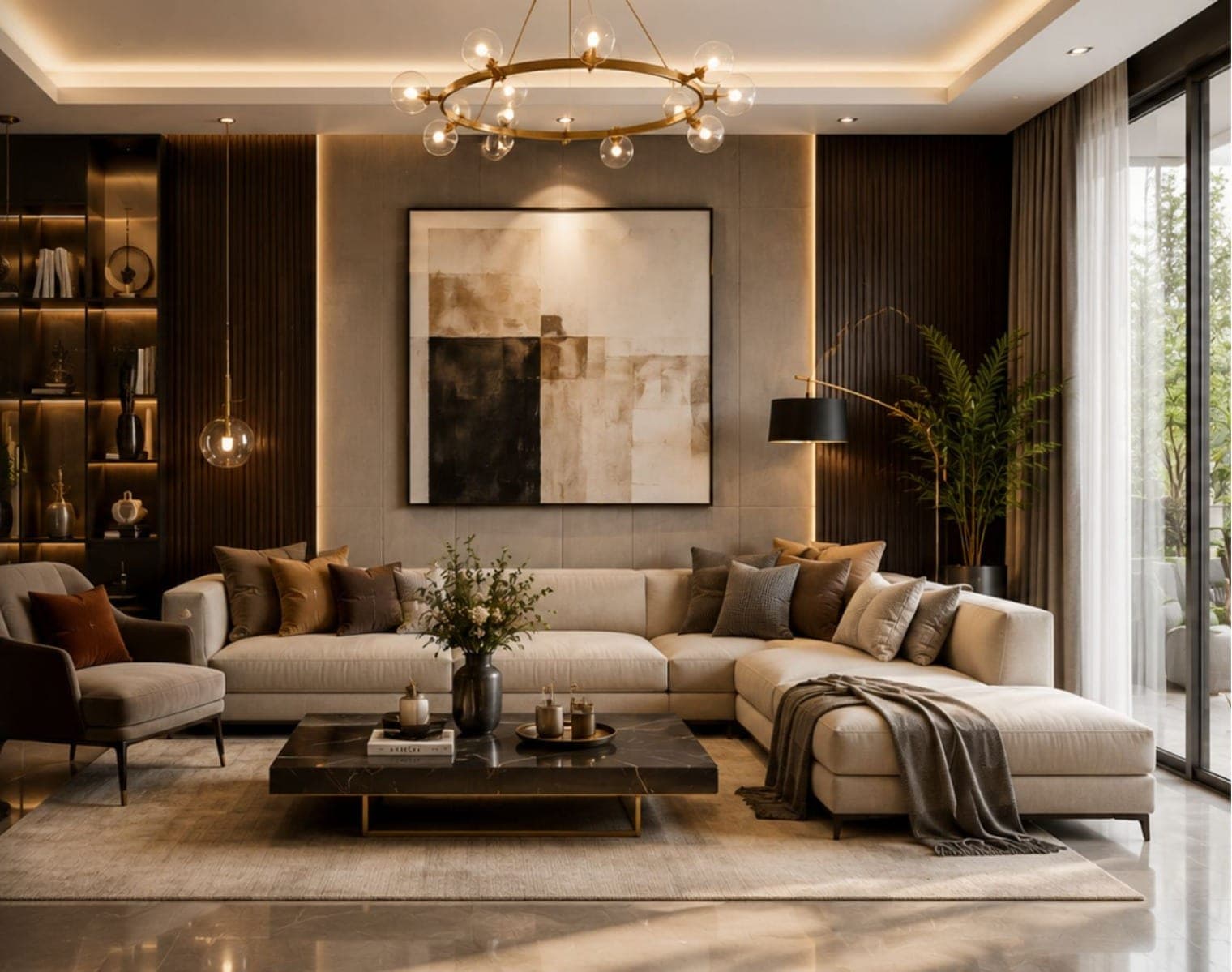
Single statement
One large piece sized to about two-thirds of the furniture below and centred at eye level — the calmest wall, and the hardest one to get wrong.

Art in Indian homes tends to hover near the ceiling in a frame two sizes down. Both are proportion errors, and both are free to fix. We size the print to the wall and set it at eye level — the two changes that make a room look considered.
Almost every mistake with prints is a size mistake. A print two-thirds the width of the furniture below it, centred at 1450mm, hung 150–250mm above the sofa back, with consistent 50–75mm gaps in a group — get those right and cheap prints look expensive.
Print width vs the furniture below
Centre height — gallery standard
Gap above the sofa back
Sized to the wall,
not to the frame shop.
Almost every print wall that looks off is a proportion or placement error, not a taste one — and all of them are free to avoid. These six rules keep a wall of ordinary prints looking deliberate.
Wall fixings
Matched to what's behind
Solid masonry, a hollow block or a plasterboard partition each need a different anchor. Into the wrong one, a heavy frame pulls out and takes a chunk of wall with it.
Load rating
Anchors well over the weight
Framed glass is heavier than it looks. We fix well above the piece's weight rather than to a nail's rough guess, so nothing creeps loose over the years.
Glazing
Non-reflective where light hits
A glossy pane opposite a window becomes a mirror by day. On bright walls we choose anti-reflective glass or acrylic so you see the art, not the room.
Lighting angle
Lit to miss the glass
A downlight straight ahead bounces glare off the frame. We aim the light to graze the surface so the print reads without a hotspot across it.
Backing
Sealed against the damp wall
An external or ground-floor wall pushes moisture into the mount and spots the print. A sealed backing and a slim air gap keep the paper dry behind the frame.
Hanging system
Two points, adjustable
Two D-rings or a rail rather than one hook means a piece hangs level and stays there. It also shifts a few millimetres without a fresh set of holes.
One large piece sized to about two-thirds of the furniture below and centred at eye level — the calmest wall, and the hardest one to get wrong.
A dense cluster of frames read as one shape, the gaps kept equal — busy on purpose, and the best home for a collection gathered over years.

Two or three matched pieces in a tidy pair or row, spaced to relate to each other and the sofa — order without the fuss of a full grid.
A print wall isn't decoration you add at the end — it's the thing the eye lands on when you sit down. Scaled and placed right, it does more for a room than another piece of furniture ever would.
A print that's slightly too large looks confident; one that's slightly too small looks like a mistake. The instinct to play it safe with a modest frame is exactly what leaves a wall looking underfurnished.
The single most common error in Indian homes is hanging six inches too high — art drifting up toward the ceiling, disconnected from the furniture. Set the centre at 1450mm and everything below it suddenly belongs together.
Centre at 1450mm — gallery standard, standing eye level
150–250mm above the sofa back, not floating over it
The art relates to the furniture, not the ceiling line
Free to fix — it's a nail and twenty minutes
Send us the wall and what you'd like on it — we'll come back with a layout, the sizes to order, and where each piece lands.

Salon wall · Koramangala
The single · Indiranagar
We'd hung everything six inches too high for nine years.
Swati & Gaurav — 4 BHK, Hebbal
Visit our Bangalore studio. Walk through real kitchens and wardrobes, meet the designer who'll take your project, and leave with a transparent quote.
Tell us about your home and we'll call within 24 hours.
Prefer to talk it through?
Our Bangalore studio is open 10am – 7pm, all days.